

The act of modifying and improving a film's colors to create a particular appearance, mood or style is known in the field of local video production as color grading. It includes altering the image's exposure, contrast, saturation, and colors in order to provide viewers with a visually pleasing and emotionally engaging experience.
Ordinary video footage can be transformed into aesthetically spectacular and emotionally engaging entertainment via the use of color grading. Understanding the art and science of hue grading can significantly improve the quality and impact of your movies, regardless of whether you're an expert filmmaker or an aspiring content producer in Film District Dubai.
Color Grading Defined
Basic color correction, which mainly aims to address technical problems like white balance and exposure, is not the same as color grading. It is a creative method that enables filmmakers and videographers to accentuate storytelling aspects, portray certain emotions, and create a distinctive visual identity for their work.
Why Color Grading is Important in Video Production
For several reasons, hue grading is essential to video production. First off, it contributes to the visual and mood of a video. The narrative's tone can be established by the color scheme that is used. Warm colors like red and orange, for instance, might evoke feelings of coziness and closeness, whilst cold colors like blue and green, on the other hand, can evoke feelings of serenity or melancholy.
Additionally, color grading contributes to the continuity of a video. You may improve the audience's absorption in the tale and visual coherence by using a consistent color grading system. Consistent grading helps build your brand since it may be associated with your tone and subject matter.
Color Grading's Function in Increasing Emotional Impact
Colors may subtly alter how we see a situation and have a significant emotional impact on us. When done well, hue grading can increase a video's emotional impact and help viewers connect more fully with the message. A sense of nostalgia or sorrow may be evoked by de-saturated colors with little contrast, whilst energy and enthusiasm may be expressed by saturated and brilliant hues.
Filmmakers may direct the audience's emotional journey by subtly utilizing color to highlight significant moments and improve the overall storytelling experience. A visually appealing video may be made into an emotionally stirring work of art using hue grading.
Color Correction Versus Color Grading
Although the majority of people interchangeably use these names, they actually signify completely distinct things. Your video's neutral and natural hues will be restored through hue correcting. Perhaps you used warm lighting when you took the video, in which case you would be altering the temperature. Or perhaps you accidentally underexposed your movie and need to restore the color exposure. The goal of hue correction is to make your film appear as realistic as possible; it is not stylistic in any way.
The opposite of color correction is color grading, which is similar to applying a stylistic filter on your film.
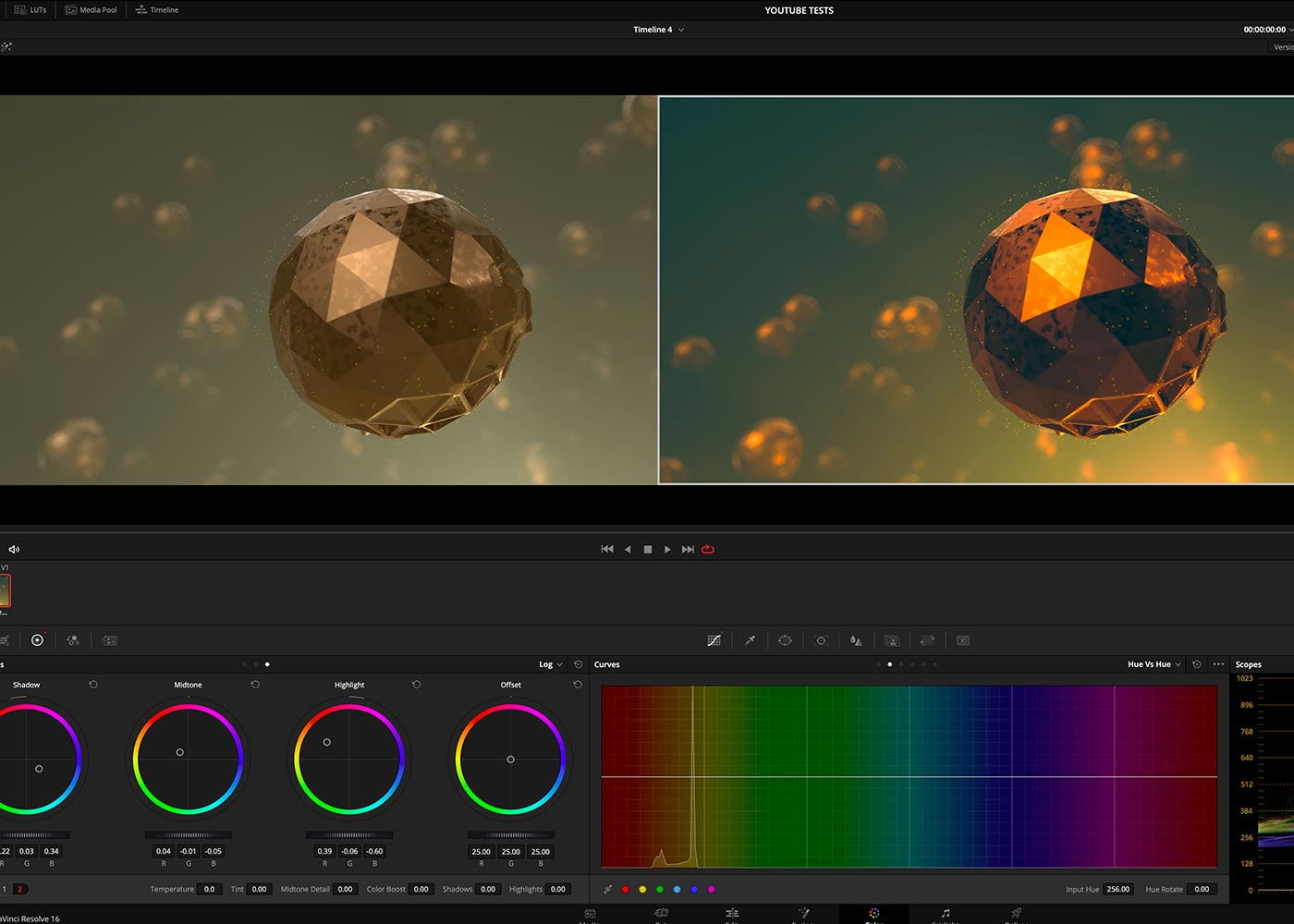
Identifying the HSL, Highlights, Shadows, and Midtones
You must comprehend these 6 fundamental ideas, namely Highlights, Saturation, Shadows, Midtone, Hue and Luminance, in order to grasp color grading for videos. They will make it easier to conduct better color correction, find the precise location in a video for color grading, and make coloring modifications.
Tone the highlights, shadows, and midtones in a video with the Curves tool.
1. Highlights: In a video, highlights are the parts that are the brightest.
2. Shadows: The darkest portions in a video are called shadows.
3. Midtones: The midtones fall between the highlights and the shadows and are neither very light nor overly dark.
In order to add your own distinctive flare or style to your film, you may manually adjust the Highlights, Shadows, or Midtones by dragging the Red, Green, and Blue channels of Curves.
As an illustration, pulling up the blue curve in the highlights will add blue to them. The shadows will get more yellow as you move the blue curve to the bottom.
To color grade the highlights, shadows, and midtones of a video, use color wheels.
Understanding Hue, Saturation and Luminance
1. Hue: The color itself, such as Red, Blue, Green, Cyan, Magenta, or Yellow, is referred to as the hue.
2. Saturation: Saturation regulates hue intensity.
3. Luminance: The color's brightness and darkness are determined by luminance, or lightness.
Therefore, you can adjust or improve the hue, saturation, and brightness to tone highlights, shadows, or mid-tones regardless of the color grading program you use, such as Davinci Resolve 17, Adobe Premiere Pro, or Final Cut Pro. Your own preferences, aesthetic standards, and the real requirements of the film production will all determine how you proceed.
Trending Hue Grading Color Schemes
We would like to provide you with 4 well-liked color schemes for color grading in videos and movies if you are new to the process. As a result, you can use them as needed.
1. The use of complementary colors
Two hues that are opposite one other on the color wheel are said to be complementary. Complementary colors typically include hues like red and green, yellow and purple and orange and blue.
Utilizing complimentary colors for hue grading might be the ideal choice if you want to convey a dramatic difference in a character's inner sentiments or grab viewers' attention through color contrast.
In actuality, a lot of YouTubers hue grade their films using the well-liked complimentary hues "Teal and Orange" to make their videos look more dramatic and appealing.
2. Analogous Colors
On the color wheel, analogous hues appear as neighbors adjacent to one another. Yellows, Orange Yellows, and Orange are iconic analogous hues.
Analogous hues are your greatest choice if you want the colors in your movies to be exceptionally eye-pleasing and comfy since they create the impression of harmony and constancy.
3. Triadic Colors
On color wheels, triadic colors are three hues that form a triangle. Standard triadic hues are Orange, Green, Purple, Yellow, Blue, and Red. Triadic hues have just the right amount of contrast and consistency. They can help your films maintain a delicate harmony and vibrancy balance.
Triadic hues were used in the films Superman, Hulk, and Joker to achieve unique comic-book tones and moods.
4. Monochromatic Colors
Any single hue on the color wheel is considered a monochromatic color. In a movie or film, monochromatic hues exude extraordinary harmony and tranquility. Typical instances include the movie Matrix, where green predominates.

Understanding Color Theory
The ability to control colors throughout the grading process efficiently depends on having a working knowledge of hue theory. The following are some essential ideas:
1. Primary Colors
In hue grading, red, green, and blue (RGB) are the three main colors. All additional colors are produced using these colors, which serve as the foundation for digital hue representation.
2. Complementary colors and the Color Wheel
The color wheel is a revolving illustration of colors that shows how they relate to one another. Colors that are opposite one another on the hue wheel are said to be complementary. Complementary colors can be used in color grading to provide visual contrast and highlight particular components.
3. Cool and Warm Colors
Warm and cold hues can be used to classify colors. Warm hues like red, orange, and yellow inspire vigor, passion, and warmth. Cool hues like blue, green, and purple evoke peace, tranquility, and reflection. When selecting the ideal hue grading scheme for various settings, it helps to be aware of the emotional implications that warm and cold colors have.
Typical Color Grading Methods
To create the intended effect, color grading uses a variety of methods and modifications. Here are some methods experts frequently employ:
1. Changing the contrast and exposure
A video's exposure and contrast levels can be adjusted to produce a balanced and appealing image. To maintain adequate tonal range, this process entails altering brightness, highlights, shadows, and overall contrast.
2. Color Temperature and White Balance
White balance controls a video's overall hue cast. You can assure correct hue representation and set a certain mood by altering the white balance and color temperature.
3. Vibrancy and Saturation
The strength or purity of the colors in a video are referred to as saturation. Depending on the desired outcome, adjusting saturation levels can render colors more bright or subdued.
4. Highlights and Shadows
Retaining details in both dark and bright sections of a video requires a delicate balance between shadows and highlights. Using this method, depth and dimension are created.
5. Color LUTs and Presets
Hue check in order to produce particular appearances or styles, hue grading presets and tables (LUTs) can be applied to films. They produce consistent outcomes and save time.

Equipment and Programs for Color Grading
For hue grading requirements, there are several expert software programs available. Listed below are some typical tools:
1. Professional Software
Comprehensive hue grading features are available in professional software like Adobe Premiere Pro, Final Cut Pro and DaVinci Resolve. To create the desired color effects, these tools offer cutting-edge functionality and exact controls.
2. Online Tools for Hue Grading
Online hue grading tools offer a less complicated technique to improve video colors for novices or those lacking access to professional software. These programs provide simple tweaks and user-friendly interfaces for quick and simple hue grading.
How to Apply LUTs
You can use LUT, or Lookup Table to make your movies appear equally professional. LUTs are mathematical formulae that are coded that you enter into your NLE to change the color of your film.
The cameras that are used when individuals first start shooting films typically already have software that captures real colors. You'll notice a satin-like gloss over all of your videos if you start utilizing cameras that record in LOG. Rest assured that you will be able to rectify this footage in post-production, which is why it seems that way. This will produce colors that are deeper and more brilliant. The following are the processes for adding these LUTs to your video:
1. Setting Up Adjustment Layers
You should make an adjustment layer for your LUT after importing your video and adding it to your timeline. The procedure is much simplified when an adjustment layer is used and there are several chances for complex grading customisation. Right-click within the Project Window and select New Item > Adjustment Layer to accomplish this. Drag and drop the newly appeared clip onto your video from the project window.
2. Adding the LUT
Be sure you have your Lumetri Color panel open for this stage. Go to Windows > Lumetri Color if it's not already open. Your right should see it open. You will now see a drop-down option with the name Input LUT underneath the panel. Choose Browse. From there, you may choose a LUT you already downloaded. They should do so right now.
3. Making Settings Adjustments
Try using a few different LUTs to discover which one best suits your video. Once you've decided on one, find out how it impacts your video and what modifications are required. Perhaps you should increase the exposure or perhaps alter the highlights. Keep in mind that not everything can be fixed with a general LUT spanning the whole period. Every clip is unique, therefore you should approach them all individually.

Color Grading Process in Steps
Here is a broad, step-by-step instruction on hue grading, while the precise procedure can change based on the program used and individual preferences:
1. Organizing and Importing Video
Organize your video footage into digestible chunks or sequences by first importing it into the editing program.
2. Choosing the Style and Mood
One of the most important steps in the hue grading process is defining the intended mood and tone. Think about the narrative you want to present and the feelings you want to arouse in your audience. Having a clear vision can help you make the best color grading choices, whether you're working on a bright and happy commercial or a somber and dramatic short film.
You can effectively determine the entire brightness and dynamic range of your video by adjusting the exposure and contrast. You may produce a balanced and appealing image by tweaking these factors. Additionally, boosting colors can give your movie additional depth and vitality, which can increase its visual impact.
3. Adjusting the Basic Parameters
To create a balanced starting point, start by altering fundamental settings like exposure, contrast, and white balance.
4. Fine-Tuning the Colors
Use tools like color wheels, curves, and selective color tweaks to continue adjusting the colors. Based on the feelings and aesthetics you wish to arouse, make modifications.
5. Employing Secondary Color Corrections
Secondary hue adjustments provide you greater flexibility and creative freedom by allowing you to target and alter particular colors in your movie. To achieve a desired appearance, you can isolate and modify individual hue channels, boosting or lowering particular colors. When you wish to accentuate or minimize specific colors to increase the visual impact or draw the viewer's attention, this step is quite helpful.
6. Including Artistic Effects
Experiment with extra effects like vignettes, gradients, or overlays for a distinctive and artistic touch to improve the visual impact of your film.
7. Improving and perfecting
The moment has come to improve and perfect the overall appearance of your video once you've created the main and secondary color fixes. Applying filters and effects may give your film a special touch and help you establish a certain tone or look. Additionally, vignettes or depth of field simulations can be used to give depth and dimension, which will add to the visual appeal and help the viewer focus on important aspects in the frame. It's also important to pay attention to skin tones so that they seem appealing and natural.
8. Verifying Reliability and Quality
It's crucial to examine your video for consistency and quality throughout before completing your hue grading. Compare images from the same sequence to make sure the visual flow is seamless. Adjust the transitions between the several segments to create a smooth and flawless viewing experience. To ensure a polished and expert outcome, pay close attention to details like color casts or artifacts that may have been added during the grading process.

Guidelines for Successful Color Grading
Take into account the following advice while hue grading for the best outcomes:
1. Be aware of the story and its emotional setting
Have a thorough understanding of the narrative and emotional context of your film before beginning the hue grading process. Your color selection will be influenced by this knowledge and will be sure to fit the story.
2. Make consistent use of color
Keep your hue grading decisions consistent throughout the whole video. This improves the entire viewing experience and establishes a consistent visual language.
3. Take Skin Tone into Account
Keep skin tones in mind when grading videos that feature humans. Considering that viewers frequently focus on skin tones, make sure they are attractive and natural-looking.
4. Don't Do Too Much
Although color grading may significantly improve a film, it's vital to use caution. As too stylized or overdone colors might detract from the topic itself, subtlety is frequently crucial.
Color Grading Effect on Different Genres
Different genres demand different methods for hue grading. For instance, to induce a sense of fear, a horror movie may benefit from de-saturated colors and sharp contrast, while a romantic comedy may choose warm, colorful tones.
Avoid These Mistakes!
Even while human error is inevitable, there are several blunders that colorists and video editors really must avoid. Not only will they come to seem unprofessional, but it will also lessen the video's impact and message.
Some individuals mistakenly believe that hue grading is as easy as applying filters to their Instagram pictures. Hue grading is a tedious and upsetting procedure that only "persons with a thick skin" can complete.
Professional colorists who are rushing to finish their tasks on time might sometimes make blunders. These mistakes are not always made by amateurs working alone. Typically, these errors reduce the output's quality. One should avoid making the following blunders:
1. Using a Monitor That Isn't Correctly Calibrated
The objective of almost every videographer and colorist is to create footages that clearly exhibit their primary colors and allow viewers to understand the intended message. And only a display that has been correctly calibrated can accomplish this.
You should double-check your monitor's calibration before beginning a job. Since they have a brand-new monitor that is fresh out of the box, most individuals think that the calibration is accurate. It is completely incorrect since retail stores frequently boost the saturation and contrast of their monitors to entice customers.
Additionally, you will have terrible footage if you decide to edit your films without calibrating your display.
2. Inadequate Video Footage Preparation
One significant error that filmmakers frequently do is improper video preparation. A faulty color space conversion indicates that the film was improperly prepared. Poorly prepared footage typically produces an unbalanced image.
It's not simple to prepare a video. A shortcut is frequently an incorrect cut, yet most filmmakers have a tendency to take one by starting to fiddle with the gains and individual nodes.
Making distinct nodes and identifying them differently is the easiest method to begin preparing a film.
3. Unbalanced Shadow
Have you ever seen a video with shadows that are just half opaque? And if you look closely, you may see reds and greens that are colored. Usually, an unbalanced shadow is the cause of this.
This error is made not just by inexperienced filmmakers but also by experienced videographers who are always pressed for time. Shadow imbalance also causes the shadows to be elevated or lowered when you gaze through your scope at other scenarios.
4. Excessive LUT Use
Overusing LUTs is a mistake that new editors frequently do. Videos with excessive LUT usage frequently seem lifeless. Consistency is a consideration for videographers when utilizing LUTs.
When utilizing LUTs, you must make sure that the saturation, colors, and contrast are consistent across the whole video project. Choosing your LUTs should also take your plot and the color scheme of the movie into consideration.
5. Getting Little rest
It is possible for one's eyes to readjust with enough breaks. The eyes are frequently regarded as the colorist's greatest attribute. One may add more saturation and contrast to a movie by sitting at their workstation for extended periods of time and gazing at their display for extended durations of time, dulling the image. Take a vacation from your monitor as a result; that is the greatest treatment.
Additionally, returning from a hiatus gives one the opportunity to view the project's hue grading from a new angle.

NOTE:
Many filmmakers and cinematographers take their preferred hue palette into mind when filming, even if hue grading happens in post-production. The whole spectrum of colors that the camera is able to record and make available in the movie is affected by cameras, lenses, illumination, and sensors.
1. Complementary: Colors that are opposite each other on the color wheel are complementary and produce a striking contrast. Many combinations, like blue and orange, are frequently employed in big-budget movies.
2. Analogous: Cohesion is produced by colors that are near to one another on the color wheel.
3. Triadic: Pick one main hue and two accent colors that are evenly spaced apart on the color wheel for triadic hue grading.
4. Monochromatic: Movies using monochromatic hue schemes overlay one hue, then lighten and darken it.
5. Sepia: The yellowish-brown hue of sepia evokes warmth and nostalgia.
6. Bleach bypass: To convey the bleak vividness of warfare, war movies frequently employ this high-contrast de-saturated style.
Conclusion
The crucial process of hue grading during video production has a big impact on a video's visual impact and emotional resonance. You may turn your films into engaging pieces of art by comprehending hue theory, using standard hue grading processes, and utilizing the right equipment and software. Don't forget to keep things consistent, keep the story in mind, and use hue to convey feelings. To elevate your video material, start into the subject of hue grading right away.


